Make Your Vault Look and Read the Way You Want
I wanted my notes to look right without dealing with CSS. I showed Claude a picture, told it what was off, and got a sidebar and notes I like.
I wanted my vault to look right. Not a theme someone else picked, and not the default gray, but a place I'd actually want to open every morning, with notes that tell me where things stand before I read a paragraph. You can get both now by showing Claude a picture of what you like, saying what you want in a sentence, and telling it what's off until it matches.
For years I had two options: live with the default look, or spend an evening hunting for a theme and then in forum threads guessing which of a hundred settings controlled the sidebar. I never learned the styling side of Obsidian, and I still haven't. What changed is that I stopped trying to write it and started describing the result. Claude does the reading that used to cost the evening.
This post belongs to a series on keeping your notes in markdown and letting Claude do the parts that used to be expensive. The argument going around is that documentation should move to HTML because it looks better and can do the layout. I'd rather keep the plain files and make them look right, and this post covers both halves of that: how the vault looks, and how the notes inside it read.
My taste is only the example
What I liked was Bear. Its dark sidebar, the calm light page next to it, the way nothing competes with the text. So my example is a Bear-style vault with a dark blue rail in the Tokyo Night palette.
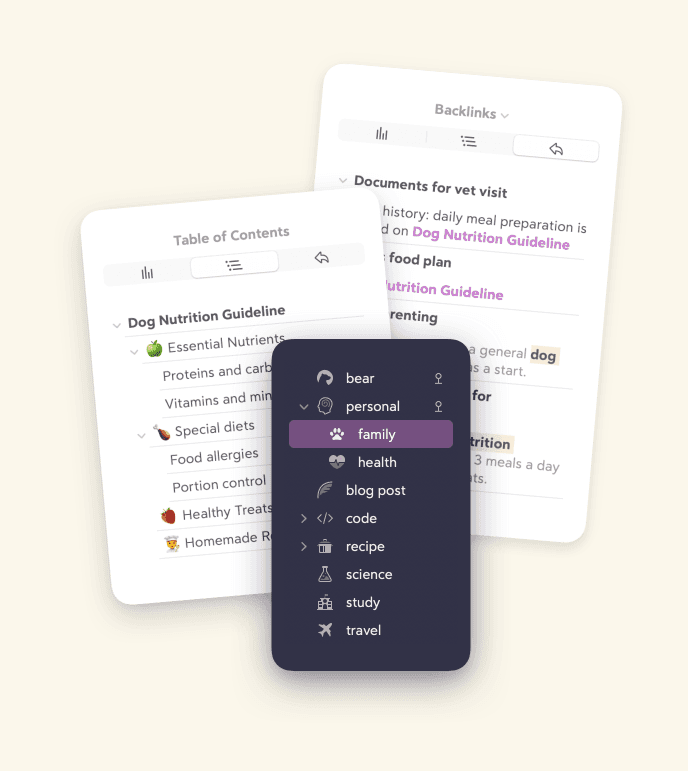
That's Bear's picture of itself, from bear.app.
You'll want something else, and that's the point. Maybe it's Craft, or a notebook you used in school, or a screenshot of an app you saw on someone's desk. The method below doesn't care what the target is. It cares that you can point at it and say what's wrong with the first try.
Show it, say it, repeat
The whole thing is three moves. I give Claude a screenshot of the look I want, tell it which part of the vault I'm talking about, and ask it to make my vault look like that. Then I switch the change on, compare, and say what's off.
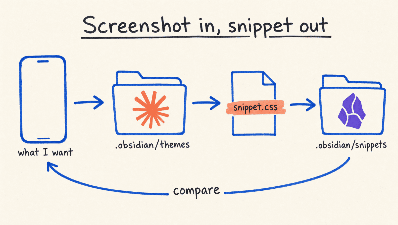
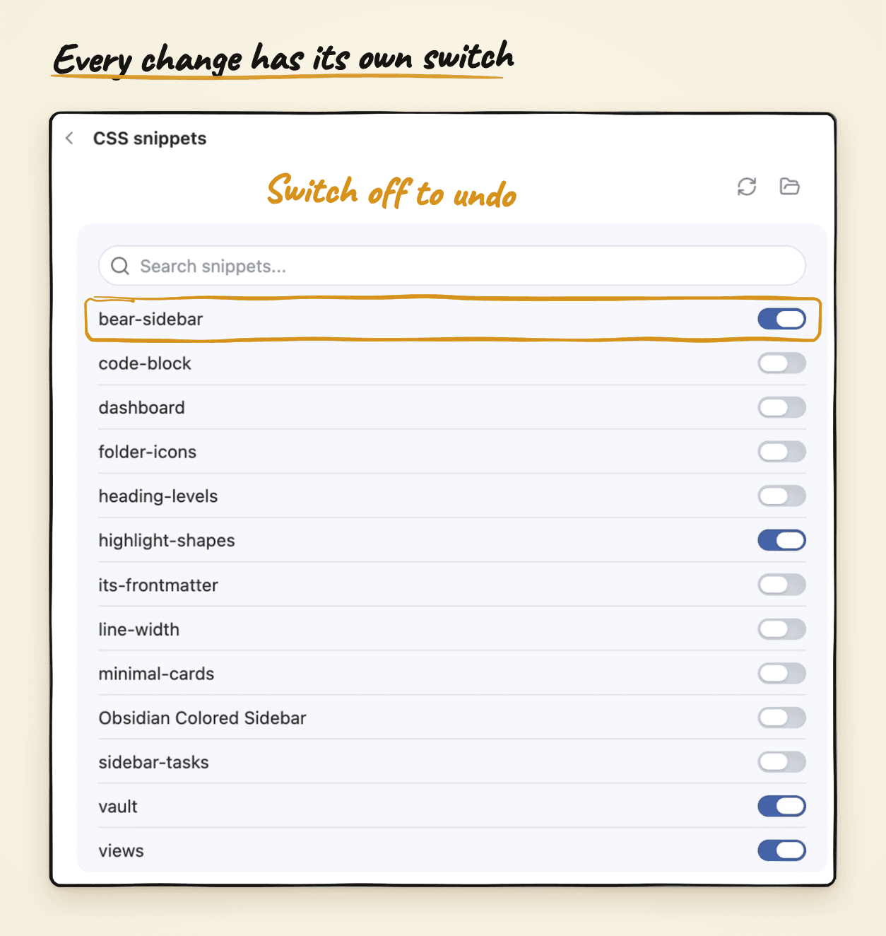
The arrow back to the screenshot is the part that matters. Claude reads how Obsidian draws each part of the screen and writes a small add-on file for the one piece I named, so I never have to learn what any of it is called. Obsidian lets you switch each of those add-ons on or off in its Appearance settings, which means every change is one toggle away from undone.
The sidebar, start to finish
The sidebar was the hardest part, so I started there. In the example vault it's drawn by a plugin called Notebook Navigator, which ignores most of Obsidian's usual styling. I didn't know that. Claude found it out by reading the plugin's own files, and it found the settings the plugin exposes for its colors.
My request was close to this:
Look at the attached Bear screenshot. I want a dark left rail in the
Tokyo Night blue, and everything else should stay light. Only change
the navigation pane. Put it in its own file I can switch off, and
explain the colors in a comment at the top.
I named one surface, the dark rail and nothing else, because "make it look like Bear" is too loose. A change that restyles the sidebar and the editor together ends up repainting the whole app. One surface kept the result small and easy to undo.
What came back was one small file, and a choice I wouldn't have made on my own. It used two shades of the same blue: a bright one on the dark rail, and a darker twin for links and buttons on the light side. The reason was in the comment it wrote at the top of the file: the bright blue washes out against a white page, so it's hard to read there, and the darker one would disappear on the dark rail. I'd have picked one blue, found half of it unreadable, and blamed the theme.
The picture shows what's touched and what isn't.
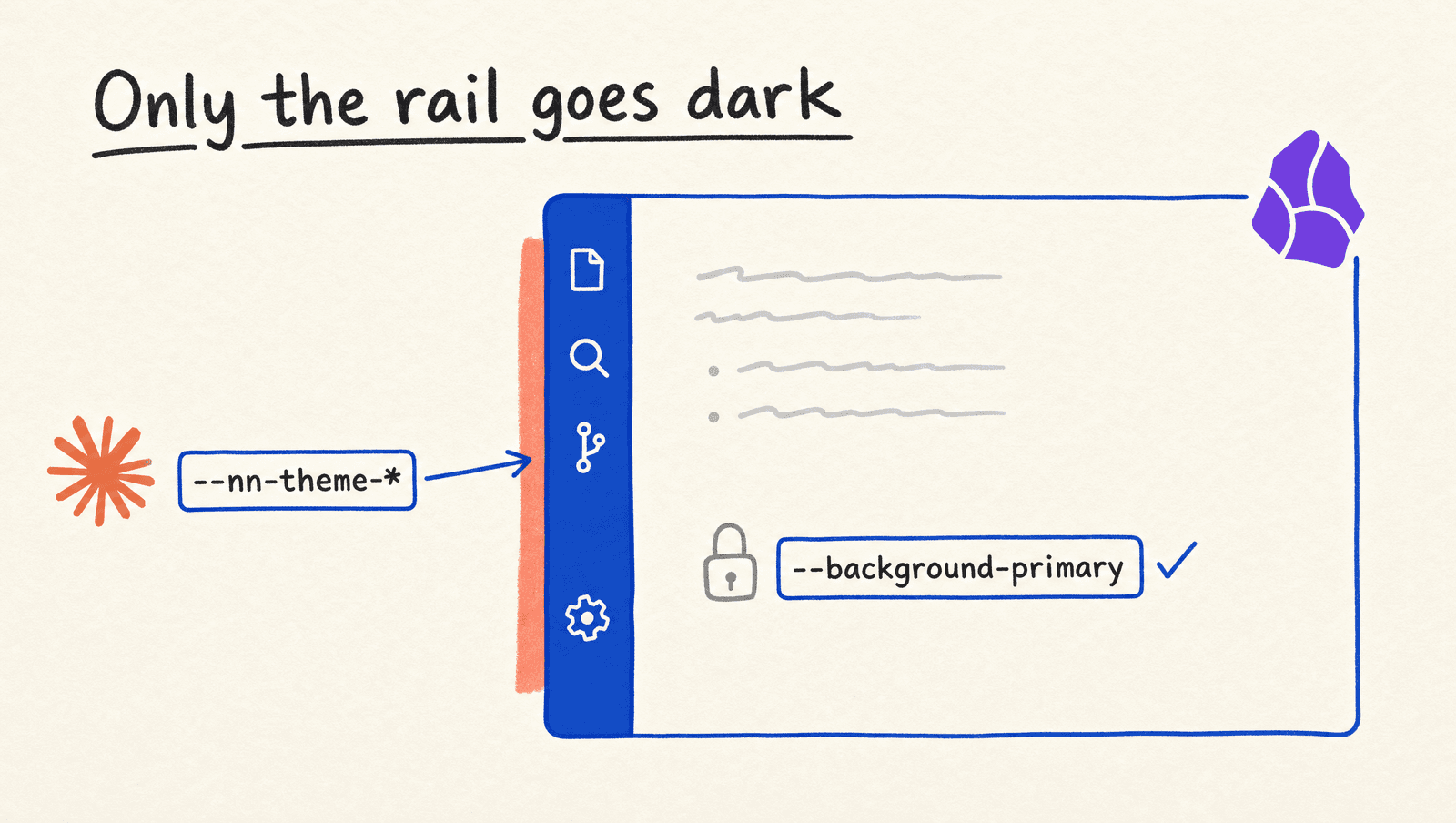
Only the rail went dark, which is what makes it feel like Bear rather than a dark mode. After that it was a few one-sentence fixes: the selected row is too bright, the counts are hard to read, the icons need to match the blue.
Here's a note before and after, with every change switched off and then on. I didn't change a word of the note itself.
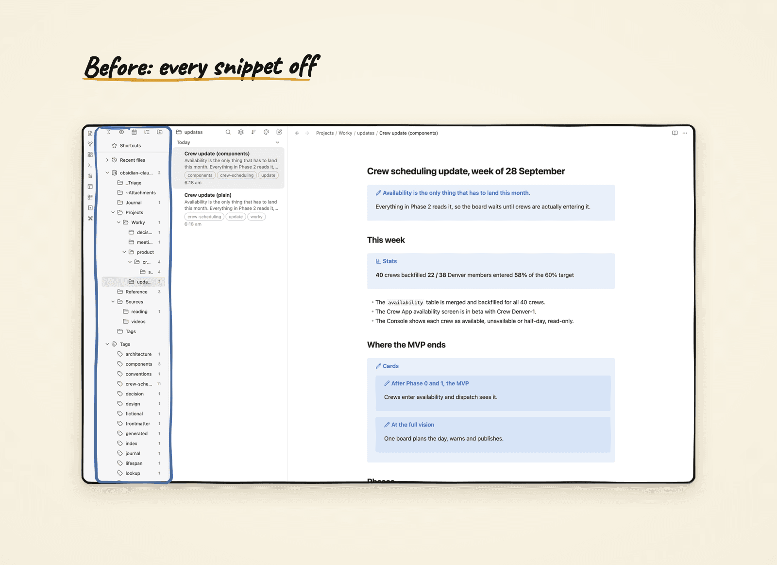
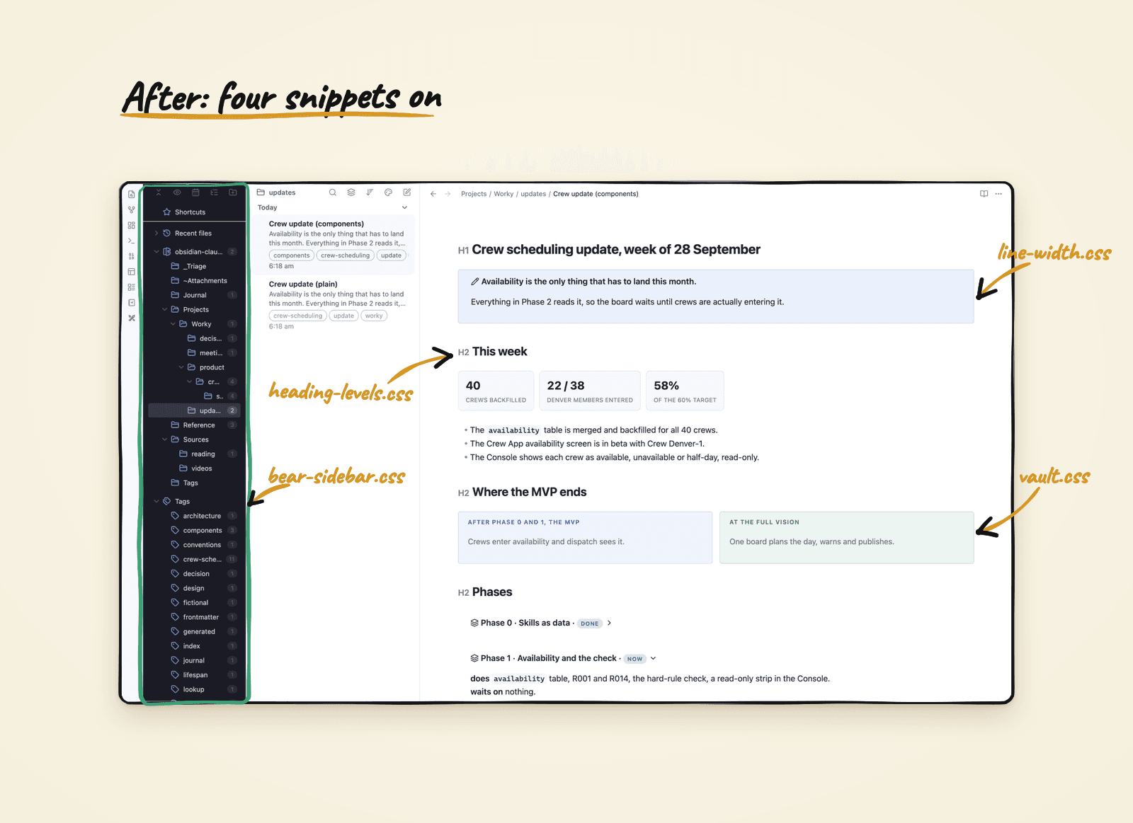
Nothing in the note moved, only what draws it. That's why I'm comfortable letting Claude change how the vault looks at all: the notes stay plain text any editor can open, and switching the look off puts you back exactly where you started.
The smaller asks worked the same way, one sentence each. "Make the reading column wider" took it from Obsidian's default of 700 pixels to 1,000, and Claude's note at the top said it only works with the "Readable line length" option on, which saved me ten confused minutes. "Show me each heading's level in the margin while I edit" added a small muted marker that hides on the line your cursor is on. And "make the Calendar start weeks on Monday" was one change to that plugin's settings. None of them was hard. The value was not having to find where Obsidian keeps those knobs.
The same method, inside the notes
A vault that looks right still holds notes that read like a wall of bullets. Every time I liked a widget in an HTML doc, I rebuilt it by hand: a two-column compare here, a green, amber and red matrix there, a pipeline with little arrows between the steps. Each one lived in the page that used it, so the next page got a slightly different copy.
Worse, I couldn't find anything I'd written in them. At one point about 140,000 words of my notes, roughly a tenth of the whole vault, sat inside HTML pages that search couldn't see. A page can look exactly right and still be a dead end: you can't search it, link to it, or stumble on it from another note. Markdown notes stay searchable and linkable, which is why I want the good look inside the notes and not in a separate page.
So I gave the shapes I kept rebuilding a name, and taught Claude the names. Here's the same weekly update written twice with the same facts. On the left it's what I used to write. On the right it's what I get now when I ask for it.
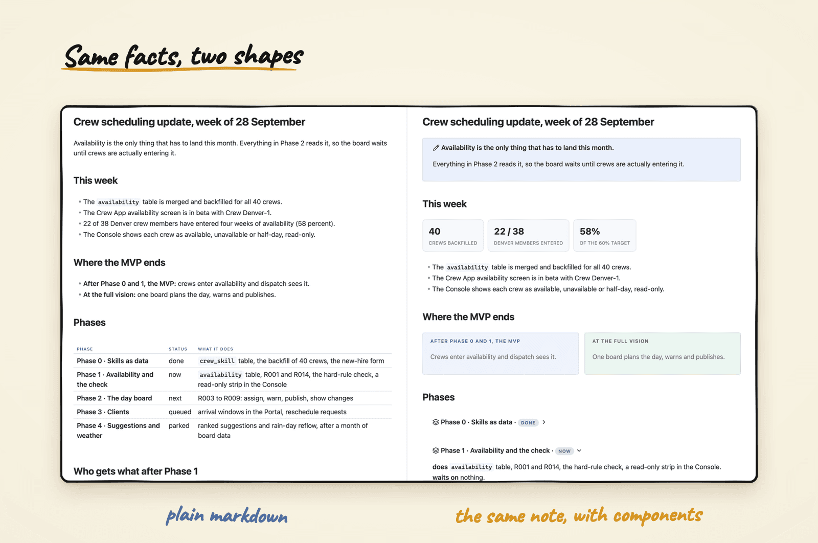
The right-hand version answers "where are we?" before you read a sentence, and it's still the same plain file underneath. My set is cards, phases, a matrix and a handful of others. If you're always writing pros and cons, meeting agendas or reading lists, those are your components.
Ask for a comparison, get cards
When two things are being compared, I ask for cards.
Compare the MVP with the full vision as two cards.
What comes back is two boxes side by side, each with a title and a line or two.
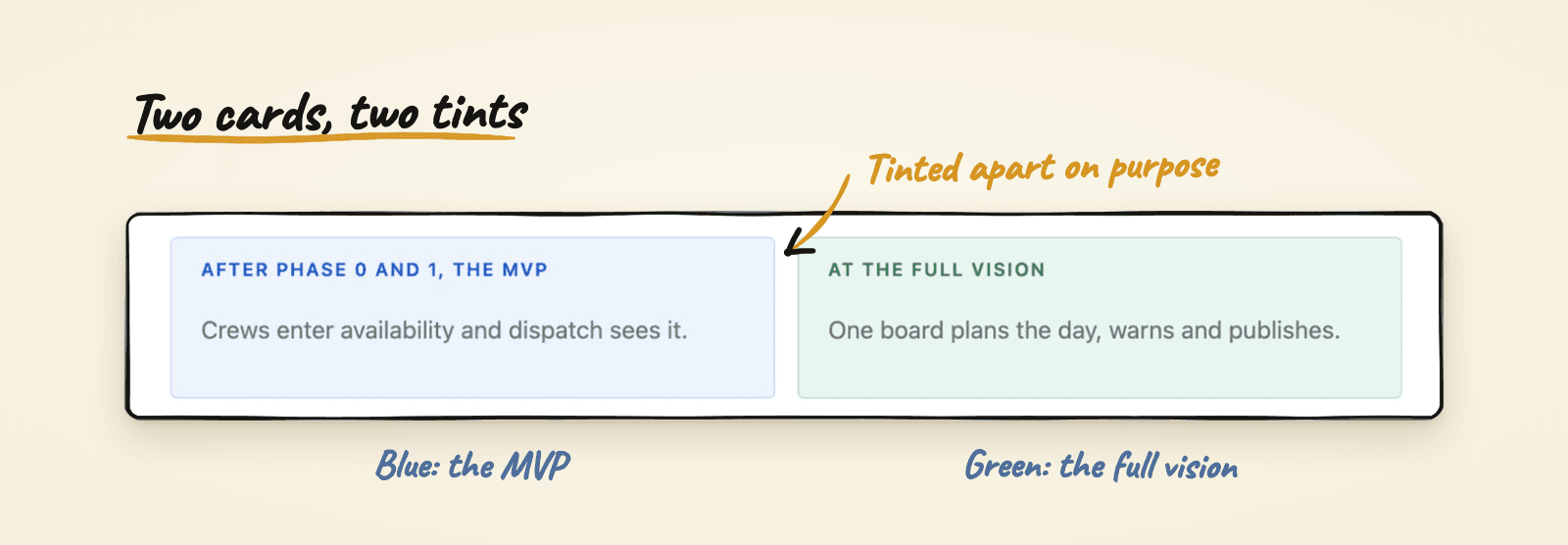
The two colors do the comparing before you read a word. That's on purpose: two matching gray boxes make the reader work out which is which, which defeats the layout. If you'd rather have them in your own colors, or three across instead of two, that's one sentence to Claude.
Ask for a plan, get phases
When the work has an order, I ask for phases.
Turn this plan into phases. Phase 1 is in flight, keep only that one open.
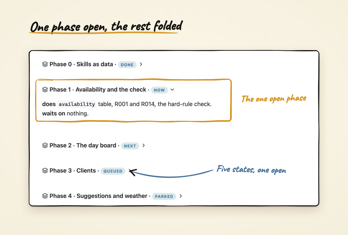
Every phase is folded except the one being worked on, so the rail reads as a column of status chips with one open block. The states are a small closed set: done, now, next, queued and parked. "Later" is missing on purpose, because it hides why something isn't next. Queued means ready but not prioritized, and parked means blocked by something outside the work.
Ask for a matrix, see the shape
This is the demo I use to explain why names matter. The example vault gives Claude a short guide to every component: its name, what it's for, and how to write it. Claude reads that guide before it writes any note, and that's how a plain request becomes a finished shape.
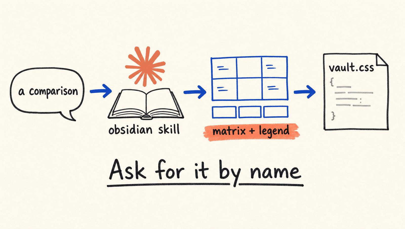
Take a comparison in plain prose: Companion has an in-editor interface and spec-kit doesn't, and for auto-mode it's the reverse, with spec-kit only partial. Read that twice and you have the facts. Now ask for it as a matrix.
Turn this comparison into a capability matrix with a legend.
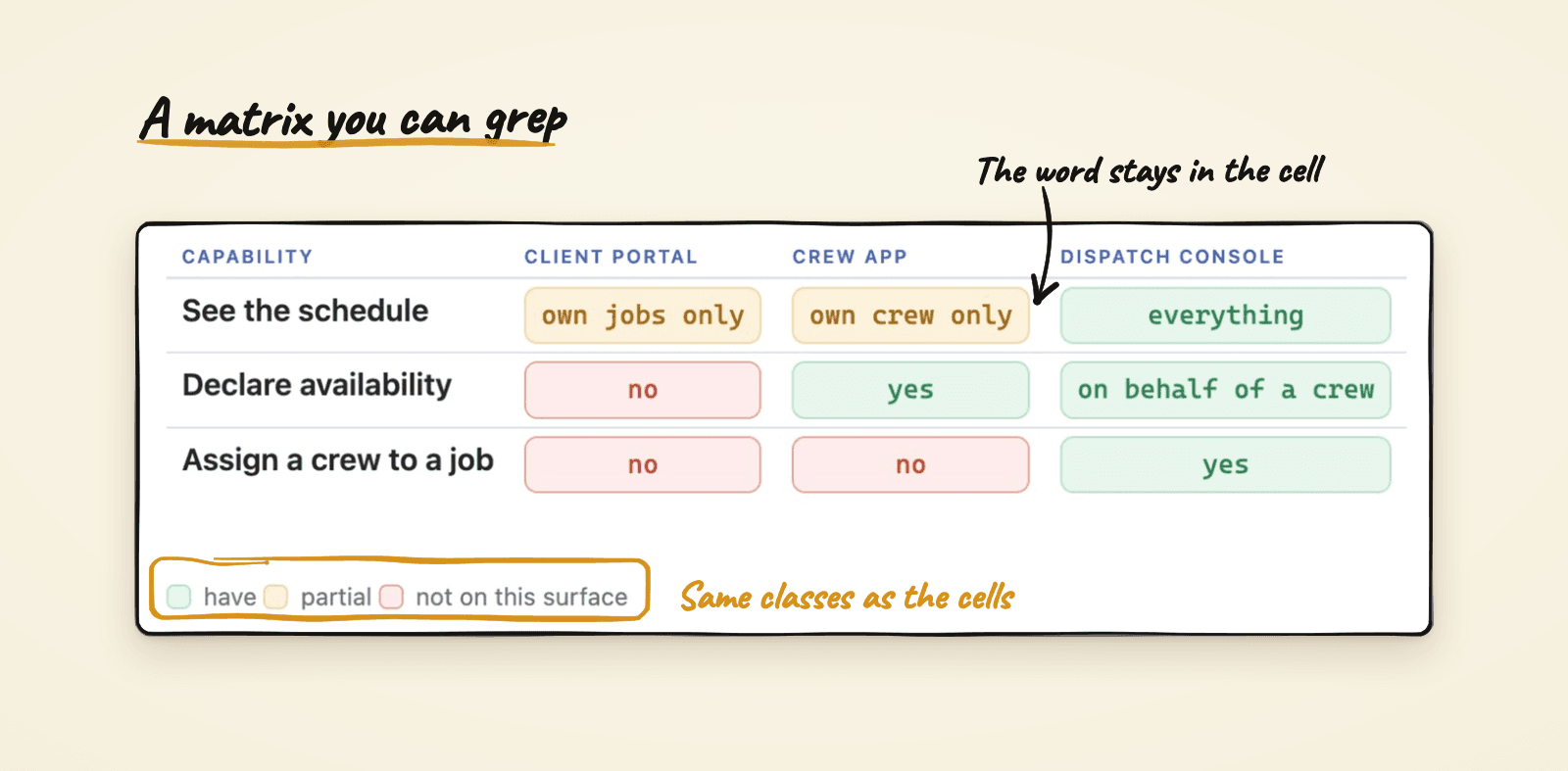
The matrix isn't prettier so much as faster. You see the shape of the data instead of holding three clauses in your head. Two rows are a toy, and at ten rows the difference is the whole point.
The rules that keep them safe
I cared about three things. Each component is one of Obsidian's built-in boxes for notes and warnings, called callouts, with a name I chose, so nothing has to be installed for the text to make sense. If the look is missing, a set of cards shows up as a plain gray box labelled "Cards", ugly but readable. And a matrix cell says "partial" in words, colored amber, instead of a yellow circle, because you can't search for a circle.
There's one more rule, and it's the first line of the components page in the example vault: don't decorate. Most notes are prose and a callout or two. A component is for content that has a shape, like a comparison, a sequence or a status.
The rest of the shelf is smaller: a box for terminal output, a frame for a diagram, a story map, a folder tree, a row of numbers when the numbers are the finding, and a few inline tags.
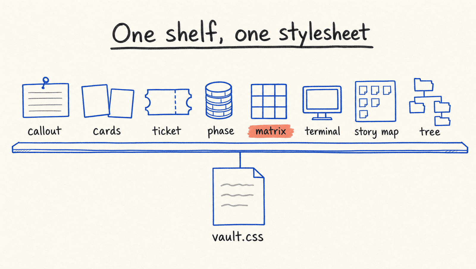
Eight shapes cover most of what I used to build by hand in HTML, and they share one look, so a note from March matches a note from today. The guide also carries my mistakes, which is what makes the corrections stick. The one I remember is a story map that borrowed the matrix's legend and showed colors that appeared nowhere in the map. Nothing errors to tell you a key is lying. Now "the legend uses the same colors as the cells" is written where Claude reads it, so I'm not correcting it in every note.
Build your own views: a dashboard, a board and a canvas
Components change how one note reads. Sometimes what I want is a page that looks across many notes: what's in progress, what's stuck, what changed this week. Obsidian has three ways to build that, and I ask Claude for each of them the way I ask for everything else.
A dashboard that keeps itself current
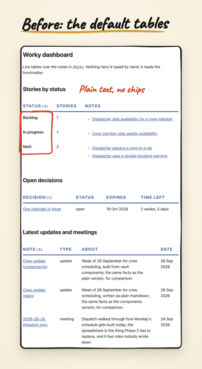
The Dataview plugin builds a page from what your notes say about themselves, like a status or a date. Nothing on the page is typed by hand, so it can't go stale. In the example vault it powers a Worky dashboard with the crew-scheduling stories counted by status, the open decisions, and the latest updates and meetings.
Make a dashboard page for the Worky project. Show its stories grouped by
status, the decisions that are still open, and the latest updates and meetings.
Then I adjust. "Make the status a colored chip." "Only show this week." "Put the blocked ones at the top." Each one is a sentence, and the page rebuilds itself when the notes change.
The same page with one snippet switched on. Nothing about the data changed. The statuses became chips, the headers got quieter, and the dates now stay on one line:
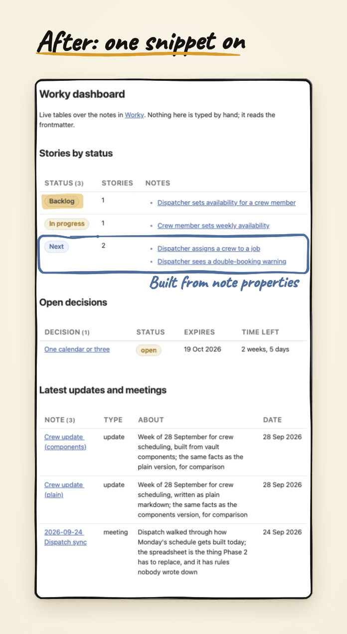
The latest-updates list only works because each note carries a date at the top. I hadn't written one, so I asked Claude to add it to the three notes and to sort the list by it. That's the pattern with a dashboard: if a table can't show something, the notes don't say it yet, and you ask Claude to make them say it.
The dashboard is a question the vault answers every time you open it, which is why I stopped keeping status lists by hand.
A board where cards are notes
Obsidian's Bases feature can show notes as a Kanban board. Each column is one value of a property, like status, and each card is a note. Drag a card to another column and Claude isn't involved at all: Obsidian changes that property in the note for you.
Show the crew-scheduling stories as a Kanban board, one column per status.
That gave me the board.
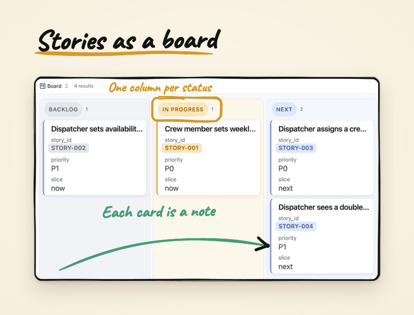
It has limits, and a good review of it at Practical PKM lays them out. A board groups by one property only, every card has to be its own note, and you can't reorder cards inside a column. As of this writing it's also an early-access feature in Obsidian, so it may not be in your version yet. It isn't the older Kanban plugin, which keeps its cards inside a single file. If you need a plain checklist board in one note, that's a different tool.
A canvas for arranging things
A canvas is an open board of cards and arrows, which suits a story map better than a list does. The example vault has one for crew scheduling, with the stories laid out in lanes. I asked for softer cards, and the look came from a snippet, the same as the sidebar. What came back is plain white cards with quiet borders inside tinted lanes, with a yellow card marking the one thing that blocks the rest.
Make the cards on the story map softer: rounded, a pale tint per lane,
and no heavy borders.
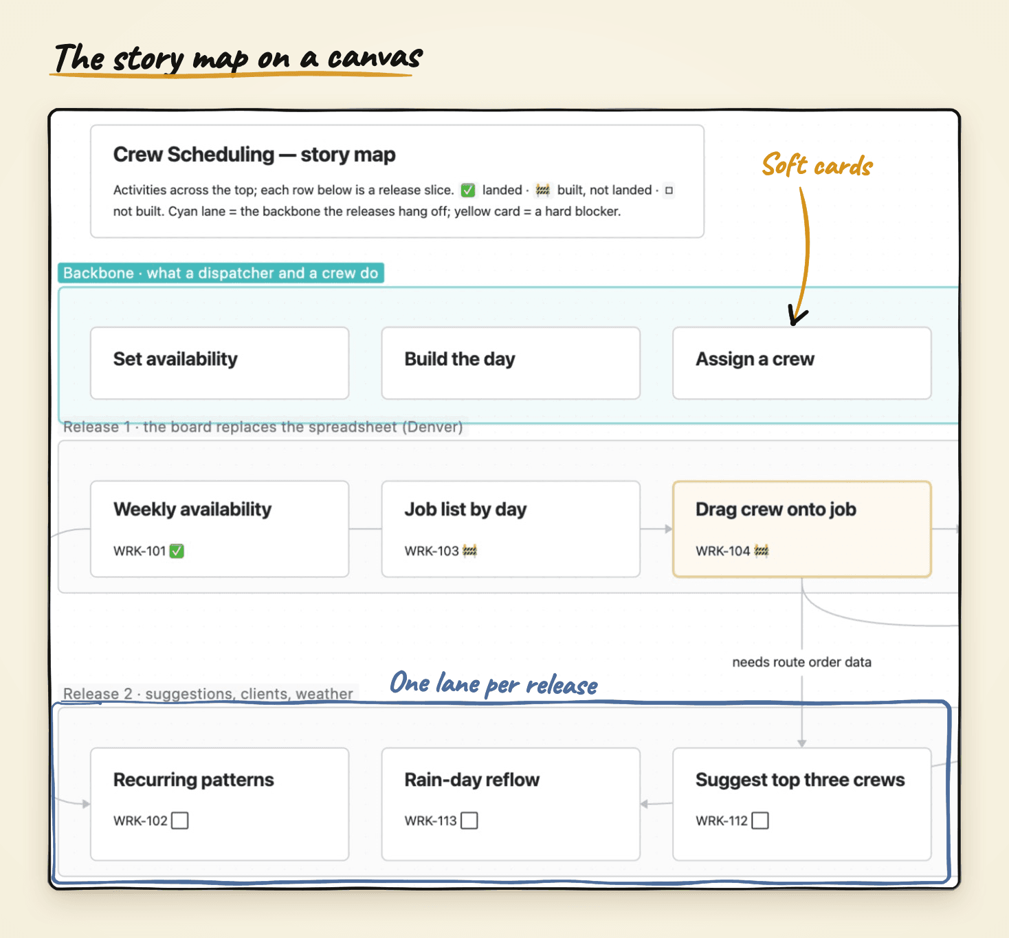
The lanes and arrows say where a story sits in the whole plan, which a list of the same stories can't.
One idea behind all three
All three read your notes as they are. Nothing about the notes changes to make them show up: they stay plain markdown, with a line at the top saying what they are. You style the view, not the data. So I ask Claude for the view, look at it, and say what to change, and if I ever drop the plugin, the notes are exactly what they were.
Good plugins to start with
The example vault switches on six community plugins. Each one is something you can set up by saying what you want, the same way as the sidebar.
- Notebook Navigator replaces the file list with a two-pane browser, folders on the left and notes with a short preview on the right. It's the Bear feel. Try: "Show two lines of preview under each note and hide the note that shares its folder's name."
- Calendar puts a month view in the right sidebar and opens the note for any day you click. Try: "Add a week column to the Calendar so I can open a note for the whole week."
- Dataview turns a question into a list that keeps itself up to date, like every open decision in a project. The example vault's Worky dashboard is built with it, so you can see one at work. Try: "Add a list to this project note of every note tagged decision that isn't done."
- Excalidraw lets you draw diagrams that live in the vault and stay editable. The skills that write a product spec or a roadmap save their diagrams this way. Try: "Draw this flow as an Excalidraw diagram I can move things around in."
- Callout menu adds a right-click menu to any box in a note, to change its kind, fold it or copy what's inside. Try: "Add my component names to Callout menu so I can turn a box into cards or phases with a right-click."
- Admonition is switched on too, but honestly nothing in the example vault needs it, because Obsidian's built-in callouts draw every component. You can skip it.
One plugin was removed on purpose: Code Styler restyles the small code-looking tags that the phase and story chips are drawn from, so it breaks them.
The loop for plugin settings is the same as for the look: you say what you want, Claude changes the plugin's settings, and you reload the plugin.
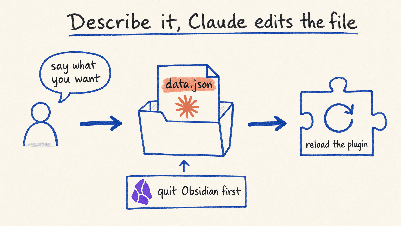
The coral note is the catch worth knowing before you start. Obsidian keeps some settings in memory and writes them back when it closes, so a change made while it's open can get quietly overwritten. If a change doesn't stick, quit Obsidian, ask again, and reopen.
Claude will also tell you when you're asking the wrong plugin. I assumed I could point Calendar at a folder for daily notes, and Claude came back and said Calendar has no such option: in the example vault, Notebook Navigator decides where daily notes go. I'd never have found that by clicking through settings panes.
Keeping it tidy
I asked Claude to keep each change separate: one for the sidebar, one for the reading width, one for the heading markers, one for the components. When an Obsidian update breaks one thing, I switch off one piece instead of hunting through everything. I also kept the comment Claude writes at the top of each change. It's the only record of why the sidebar uses two blues, and six months from now I won't remember. Because all of this lives inside the vault folder, it travels with the notes to any machine they sync to.
Try it
Open your vault, take a screenshot of an app whose look you like, and ask Claude for one thing: "make my sidebar look like this, and only the sidebar." Switch it on, say what's off, and go again. Then pick one comparison paragraph you already have and ask Claude to "turn this into two cards." When you catch yourself asking for the same shape twice, ask Claude to give it a name and add it to the guide. The example vault at github.com/alfredoperez/obsidian-claude-vault has my Bear version and my set of components if you'd rather start from something and take it somewhere else.
Under the hood
Each change to the look is a CSS snippet, a small file in the vault's .obsidian/snippets folder that Obsidian lists under Settings, Appearance, CSS snippets: bear-sidebar.css, line-width.css and heading-levels.css. One stylesheet, vault.css, draws every component, keyed off each callout's name so plugins don't break it. The guide Claude reads is the obsidian skill in .claude/skills, and Reference/Components.md shows every component. A small stylesheet, views.css, gives the dashboard and the canvas their look, and the board is a .base file next to the stories it shows. Plugin settings live in each plugin's own folder, and .obsidian/README.md lists the six plugins and why each is there. All of it is in the example vault.